
Thursday 29 December 2016
Album Name - CHANGES
Thursday 15 December 2016
Planning Conclusion
This is the end of my planning section, as I have completed all the things necessary in preparation of starting my production which will take place very soon.x
Sunday 27 November 2016
Typography


Music Video Mock Up
This is an example of what i intend my music video to look like. i have used existing music videos and i have split and cut the parts that i want using a software that one of my group members told me about.This software allowed me to put things together and end up with the video above.
Saturday 26 November 2016
Wednesday 23 November 2016

Tuesday 22 November 2016
Digi Pak- Ideas
 - This album cover was chosen because i liked the half cover of red and half normal, furthermore it gives it a simplistic look however makes the album look nice which is the feel that i would like for my album cover and the album cover links with the album name.
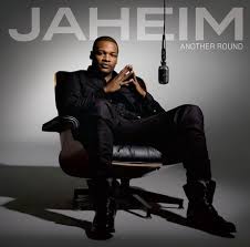 - i like the chair look, it's very iconic of old school r&b which is the look i was going for so i could use that idea.
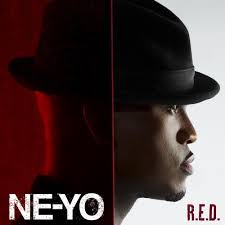
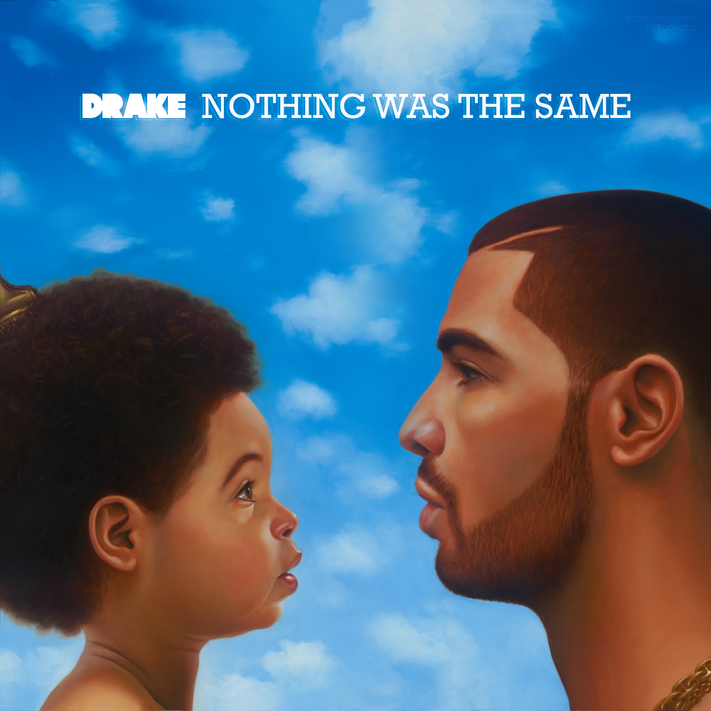
 - This is the album cover i am trying to recreate, this is because i love the background and i like the story that the album tells without actually listening to it, and this is what i want for my album
Monday 21 November 2016
Saturday 19 November 2016
Before and after edit using photoshop
Thursday 17 November 2016
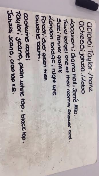
Costume Ideas
I have chosen the following pictures because they look very causal but smart which is the look that most teenagers between the ages of 17-19 attempt to go for. I would like this look because it makes it easier for our target audience to relate with the characters.it also make the video look more causal and natural looking video.
Wednesday 16 November 2016
Slow Motion
What is 'Slow Motion'?
Showing a film or playing back the video more slowly than it was made or recorded, so that the action appears much slower than in real life.Slow motion is considered to be effective because it emphasises the effect that it has and this allows the audience to become emotional as they get a deeper understanding of the action portrayed.I will attempt to use slow motion in my video because it will fit in with the emotion that the video has and also it will show the skills that my team heave developed over the course of this project.
Tuesday 15 November 2016
Original Video
In the video you can see that this is a break up video about a guy how continually messes up and the women waits for the very moment he messes up so that she can get angry with him, the majority of this video is in black and white which sets a tone to the video. we had picked this video because we can use this song and parts of the video with another video to create our own video. the settings used are desolate for example, they are under a bridge next to some water, we will struggle I replicate this part as I can't think of a place in London that is similar. the video is 4 Minutes and 37 seconds long how ever we are going to shorten the video so that it is less work and we can perfect it more. Therefore the video will only be about 2-3 minutes long.
Monday 14 November 2016

Friday 11 November 2016
Thursday 10 November 2016

Wednesday 9 November 2016
Magazine Advert - Recreation
Schedule
This is a schedule of the days that my team and I plan on filming fro our music video, this is because most of the people in our group work on the weekends therefore it is difficult to do it on these days and as we finish early on a Wednesday we decided that this is the best day for all of us.
Sunday 6 November 2016
Friday 4 November 2016
Meeting 1
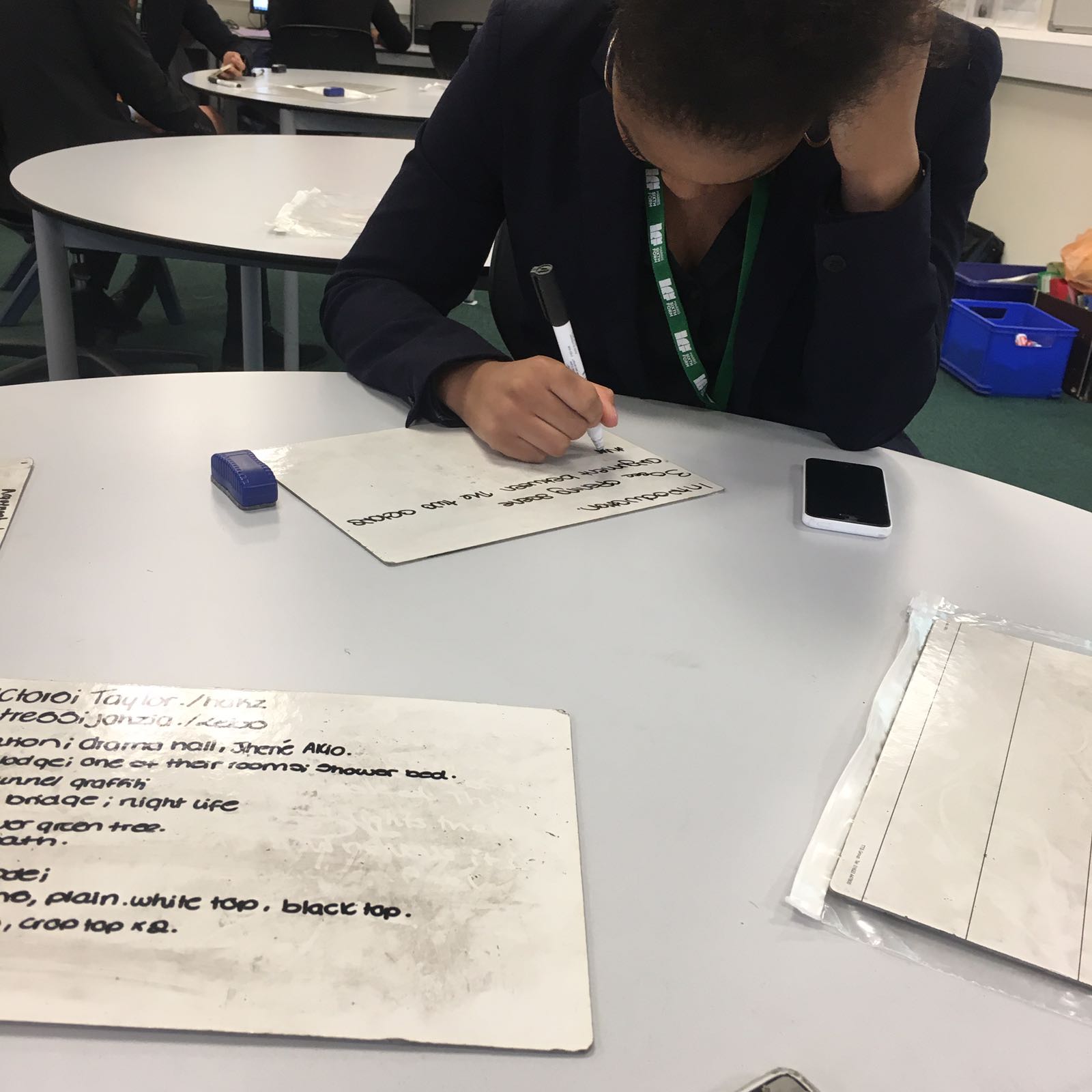
 This is one of our meetings in progress, we were discussing the ideas and what we all wanted this video to look like so that we could come up with a music video idea that we all liked and agreed on. We discussed the following
- location
- Cast
- costumes
- schedule
We will be having meetings every 2-3 weeks so that we know what we are all doing and so that we are all on track. we also have a group chat on whatsapp which is there so that we can organise when we are all available so that we can meet up outside of school time to get the work done.
This is one of our meetings in progress, we were discussing the ideas and what we all wanted this video to look like so that we could come up with a music video idea that we all liked and agreed on. We discussed the following
- location
- Cast
- costumes
- schedule
We will be having meetings every 2-3 weeks so that we know what we are all doing and so that we are all on track. we also have a group chat on whatsapp which is there so that we can organise when we are all available so that we can meet up outside of school time to get the work done.
Music Video Idea - Lighting
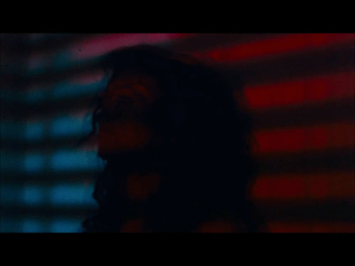 The flashing lights in red and blue give the video more of an edgy look and it makes it seem more serious. this is particular song jhene is being surrounded by the police as she has just murdered someone and she looks very vulnerable in that corner. My group thought that we could do something similar to show how the girl felt after she had been left by Chris brown in deuces.

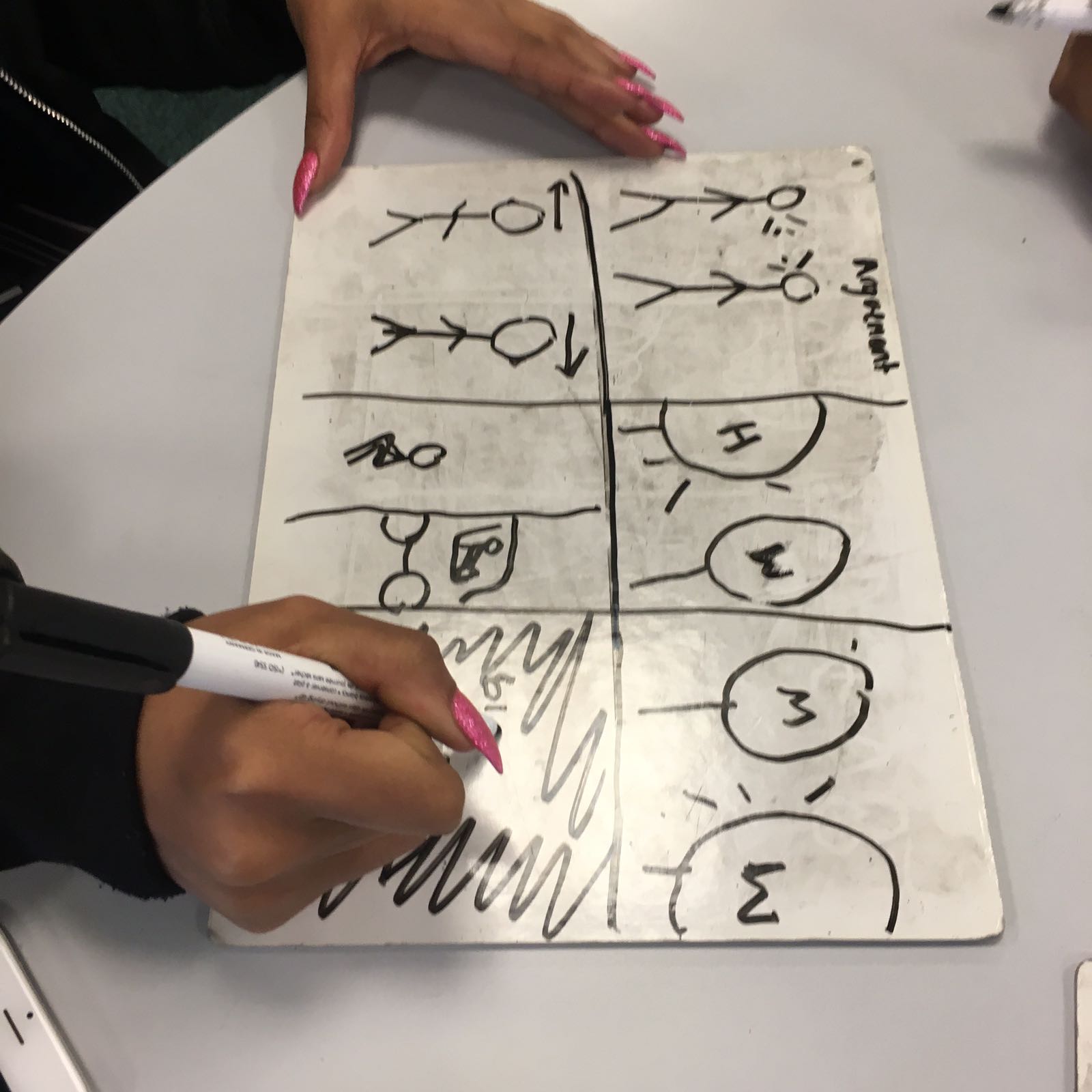
Music Video Idea - Argument (Opening Scene)
The Beginning of this song starts with an argument between the two partners and it results with one leaving, this is seen in the video Mad By Ne-Yo. This would go with our video Deuces By Chris Brown because it links to the separation between Chris and his girlfriend.
Thursday 3 November 2016
album cover mock up audience feedback
The feedback i received for this was absolutely atrocious. i understand that this was very poor as it didn't even show the skills that i had but one thing that i can take away from this is that your work needs to be to a high standard so that people can give you constructive criticism. however the feedback i did get was relatively good. i was encouraged to use Photoshop more as they could tell it was done on power point, this forced me to explore Photoshop and experiment so that my final product didn't look anything like this.some of my audience feedback team offered to help me learn the basics and a few tricks that i had not known about and they also believed in me, they know that this wasn't my best so i didn't take much offence to the comments.
Wednesday 2 November 2016
Album Cover Mock Up
This is a really poorly illustrated version of my Album cover mock up, I have done it like this so that you can see the skills that I have developed over the years. this is what I would like my Digipak to look like because it has a close up which is one of the main things that I wanted on my front cover. This is because it is easy for my audience to identify the artist. Furthermore I wanted to have a background because I think it would look really good and it would represent the artist and their situation more. from what you can see this is very poorly done and is very rushed. this means that when it comes to doing the real thing I will have more things to improve on such as making sure that my time and organisation skills are improved so that I will have the best results for my production. This was constructed on PowerPoint, this limits the things that I was able to do but this is a very basic version of what I intend to do in the long run.
From my audience feedback they have all sent me text messages saying their opinion on this, I am grateful for the feedback as they were brutally honest which is what I wanted. they were more precise with what they wanted me to improve on etc.


Monday 31 October 2016
Introduction to Planning
In this section you will see the preparation I have done in order to be able to start my production work x
Wednesday 12 October 2016
Responds To Brief
This shows the ideas that I originally had for each of the products I am due to make( Music video, Music advert and Digi-pak ).
Friday 7 October 2016
Research Conclusion
This is the end of research. i have gathered all the information i need and all the information necessary for me to be able to start the next section of planning.x
Thursday 6 October 2016
Album recreation - Audience Feedback
My audience had seen this and they thought that my album was a good imitation of the album cover nothing was the same but they found a couple of errors for example:
- The font used for the title looks too childish and doesn't really fit the theme of the album.
- Her name is difficult to read because of the font, this may need to change and the colour needs to change too.
However they said some good points:
- They liked the picture of Aaliyah jay , they thought that the way that it was edited and the way that it is positioned makes it look quite professional.
- The Colour in the background - The cloud.

Wednesday 5 October 2016
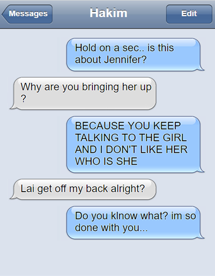
Introduction Script
This is an example of the type of conversation that will take place between the two. it will start off with somewhat good intentions and end with the both of them feeling angry and single.
this conversation will take place on the phone in a telephone box at around 10 pm but i have used a text message simulator instead to give you an understanding of the conversation that will take place.


Friday 30 September 2016
Wednesday 28 September 2016

Song Selection
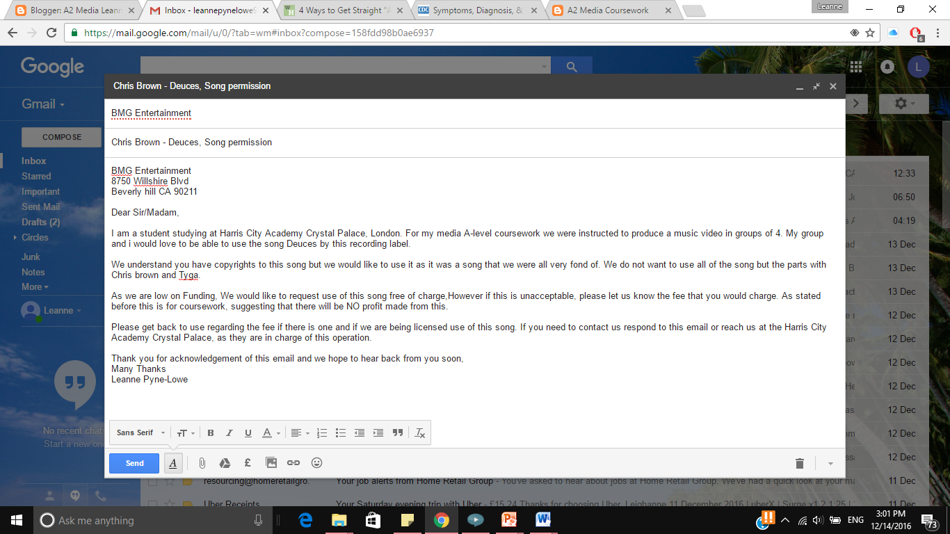
These are the following songs we chose, however we was instructed not to use these song due to the fact that they are too current which means there would be a lot of legal issues in getting the company to allows us to use the songs, this would involve writing a detailed letter to that recording label who owns that song and get permission from them to use it however there is a high chance that the label may not even see or response to that email.secondly the tempo of the songs vary from too fast to too slow which makes it difficult for us to film a music video especially since we are Beginners.
Tuesday 27 September 2016
Friday 23 September 2016
Tuesday 20 September 2016
Friday 16 September 2016
Secondary research
Thursday 15 September 2016
Thursday 8 September 2016
Conventions Of an Album Cover/Digipak
Front cover:
- Simple Colour scheme that is clear throughout the album for example black and white back group.
- Simplistic design because if it is too complicated it reduces the audience as they don't understand.
- There is no writing on the front other than the album name.
there is a barcode on the album so that they can scan it upon purchase which makes it easier to calculate how many albums have been sold for that particular artist.
- The writing is bold and clear and the title is there so that the audience are aware of who's album it is.
- There could be hidden meanings on the album cover for example on Rihanna's recent album cover (Anti)there is brail on the cover which has a hidden meaning.
Back cover:
- Copy right and year.
- Name of the recording company that has released the song.
- Barcode in bottom right hand corner and parental guidance sticker for parents.
- List of the song titles.
- Name of the artist
- The distributed of the album.
Insides:
- Evident Colour scheme
- A picture that is on both sides
- No text or little text
- Possible the lyrics to all the songs
spine:
- Name of the artist.
- Album name.
- Code for the recording company.
- Simple and clear fonts.
Thursday 4 August 2016
Friday 8 July 2016
Wednesday 6 July 2016
Sunday 26 June 2016
Wednesday 15 June 2016
Research Introduction
This is the start of my Production, where i was instructed to research into the genre and analyse various different products for example, digipak, music video and music advert. i hope you enjoy! x
Subscribe to:
Posts (Atom)